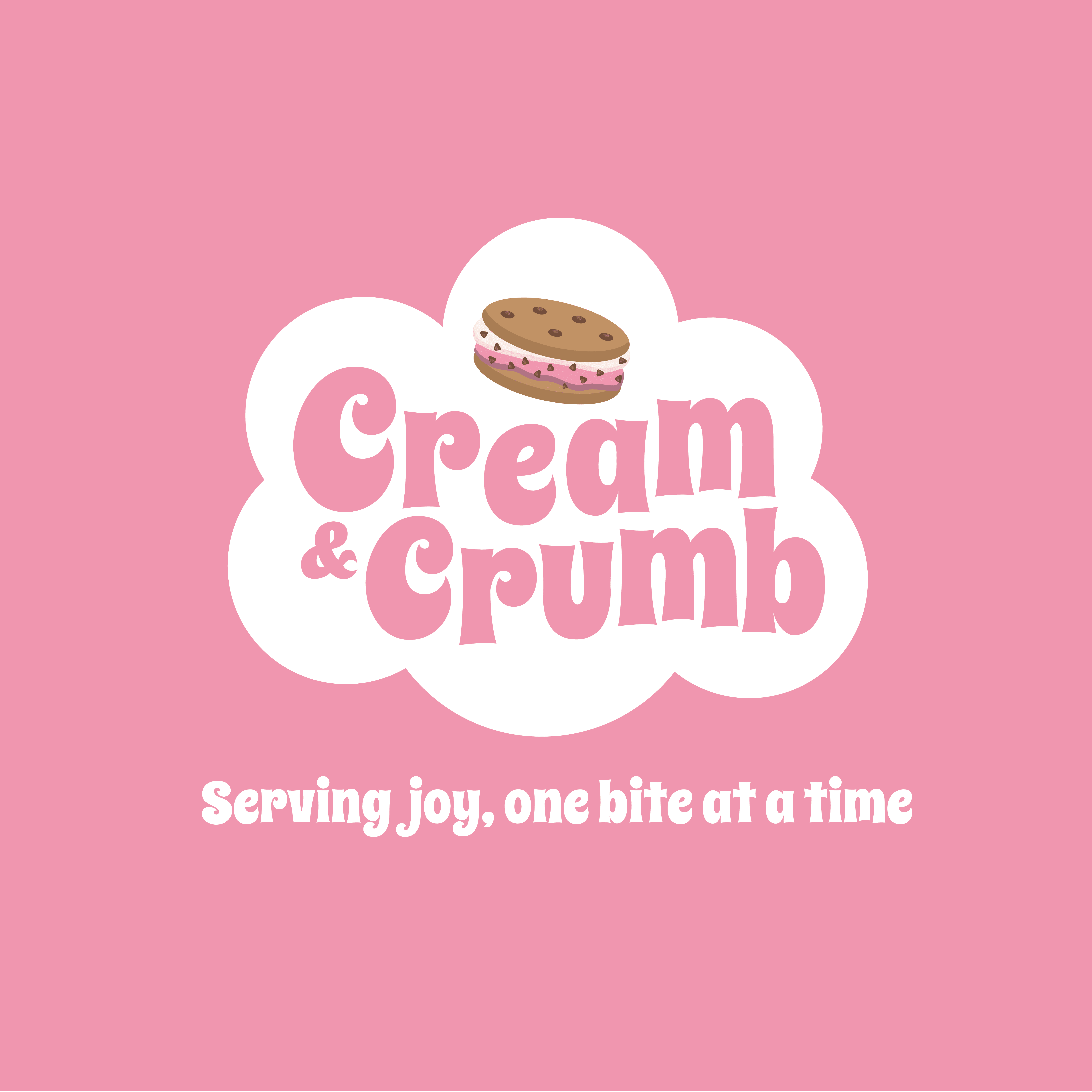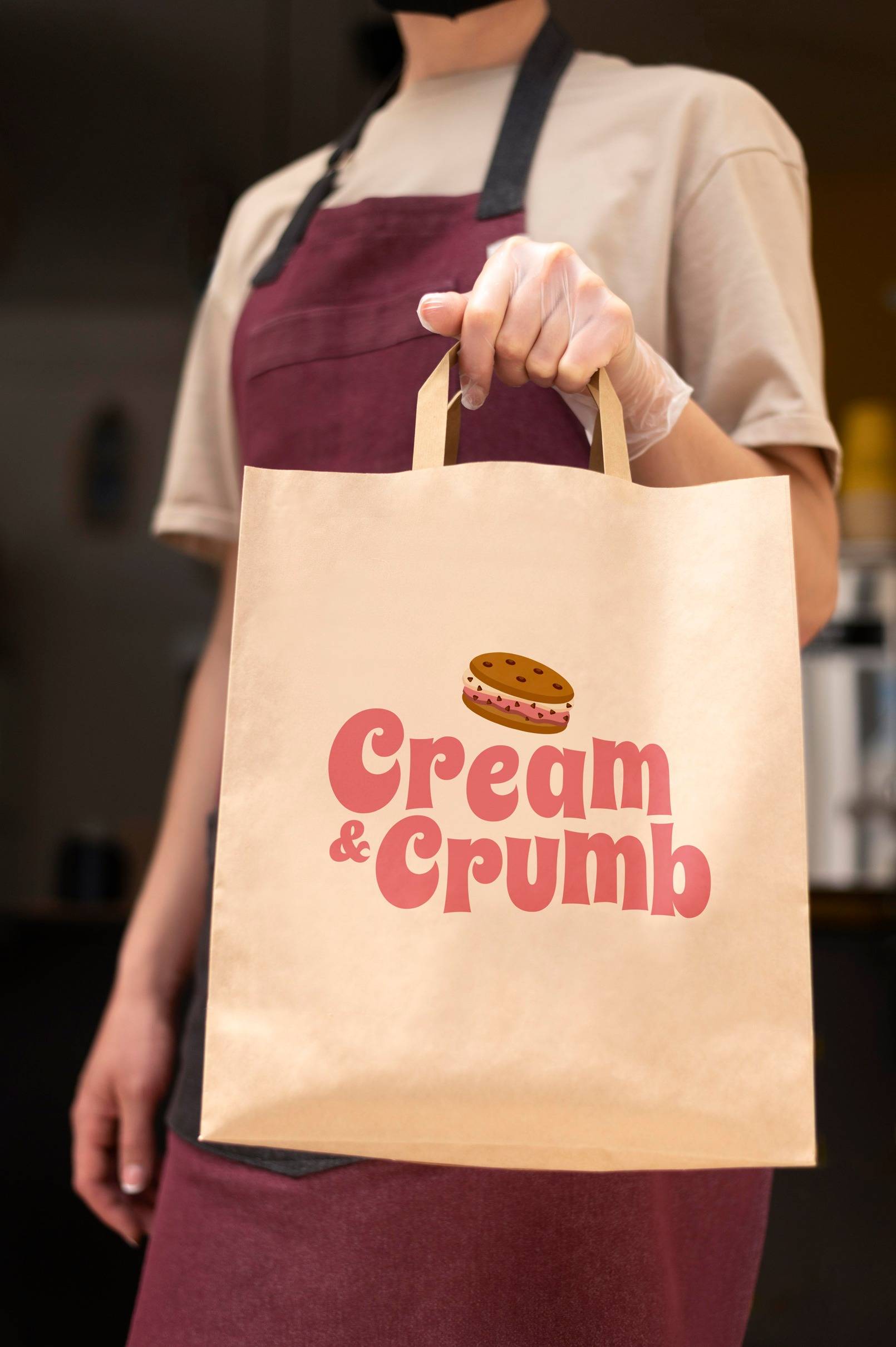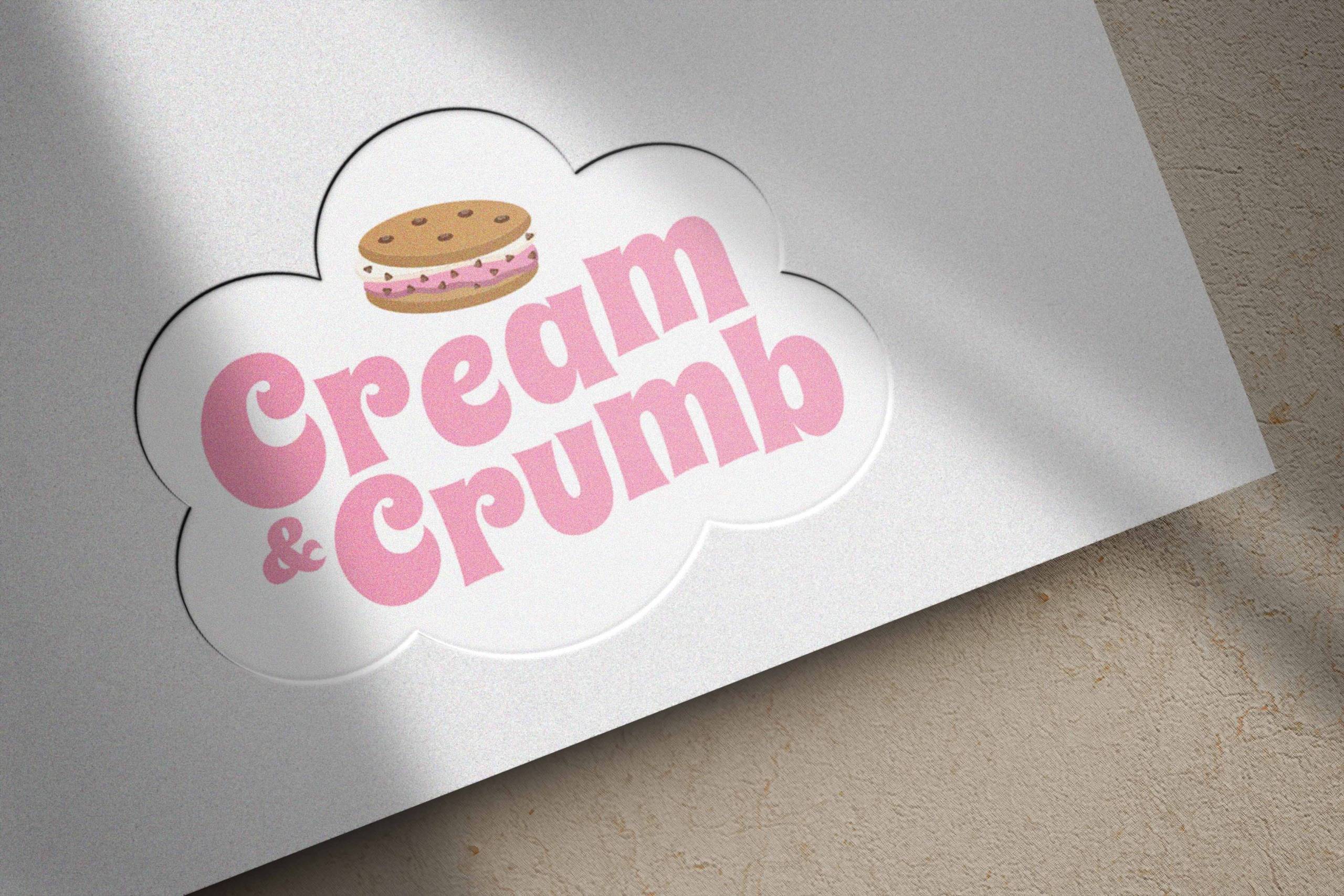
Welcome to Cream and Crub – your destination for delightful ice cream sandwiches and push pops! We may not have created the flavors, but at Tatem Solutions, we took pride in designing the logo that represents this beautiful brand. Cream and Crub offers a mouthwatering selection of ice cream sandwiches and push pops that promise to elevate your taste buds to new heights.
The enchanting hue of pink takes center stage in Cream and Crub’s palette, symbolizing not just sweetness but also a sense of joy and celebration. The soft, inviting shades of pink incorporated into our packaging and promotional materials create an immediate visual connection to the delightful experience that awaits within each ice cream sandwich.